
Web/Print
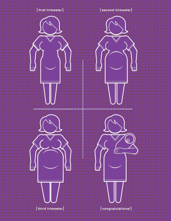
The Pregnancy Instruction Manual have infographics that pair with information on questions and situations that you may run into while pregnant. Illustrator Paul Kepple and Scotty Reifsnyder used simple shapes to recreate possible situations (like what to do in emergency deliveries) and the changes that the body goes through while pregnant. Many guides on pregnancy can be heavy with text and not enough illustrations. But this guide seems to have plenty of visuals for future mothers.
I enjoy the usage of lines and grids to show emphasis (which can be seen on the semesters of pregnancy). Purple and white is not the only color palette that this manual uses. I think this helps with the overall look. Kepple explains that he wanted to expand the limitation of colors.
Links to Illustrator web pages:
Paul Kepple
Scotty Reifsnyder


Environment
For my environment example, I found this diagram in Infographic Designer’s Sketchbooks by Steven Heller and Rick Landers. This was created by Colin Hayes and created for a magazine called AirTran Airways’ and the infographic shows how to dismember a crab before eating it. I realized my main goal while eating crab is to get as much meat out of it. But didn’t know how to properly break the legs and shell. I’ve always seen other people eat it a certain way and copied their methods. Seeing this diagram, I want to try it out now. What I learned about Hayes process is that he always sketches with pencil before scanning them in and finally drawing them digitally on Adobe Illustrator. This is exactly what I do whenever I create digital renditions of my ideas for a project. I admire his clean lines and the story (informational) he tells in this example.

